Rapid UX Research with AI Support
7 minute read
Whether launching or evolving a new product or service, we’ll put a strategic eye to your consumer research, gather reliable quantitative and qualitative data, identify the right opportunities, and provide you with scalable strategies.
The gotomedia UX Design Team uses a range of disciplines within the UX umbrella to create effective products, including user interface design, interaction design and visual design.
At gotomedia, we create memorable experiences across technology, medical devices, healthcare, and accessibility — with deep expertise in AI-integrated design, enterprise transformation, and inclusive design.
gotomedia partnered with BHI to create their new National Benchmark Web Application with a goal towards a developing a design that could be extended to future BHI products. Key priorities were modular layouts, consistent interaction methods and flexible visual design. BHI Healthcare intelligence is facilitated by Big Data creating opportunity through improvements, anomaly detection, and accurate predictions.
The strategy for the UX approach was explored using high level conceptual models prior to screen level wireframing. The three concepts solve the needs of stakeholders and users in different ways.
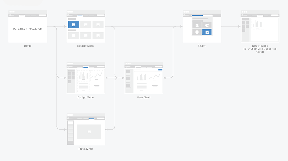
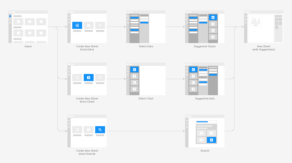
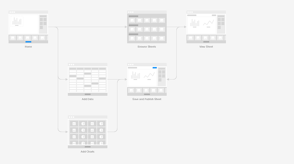
The IA phase expanded on and evolved the Workspaces Concept. The high fidelity wireframes articulated the application features & their associated interactions.
Low fidelity prototypes enabled a low risk method of exploring the application functionality and organization. The final prototype provided guidance to developers to understand complex interactions that may not be obvious in two dimensional wireframes.
The dense and layered dashboards required visual designs that emphasized clarity and legibility through their typography, iconography, and visual patterns.
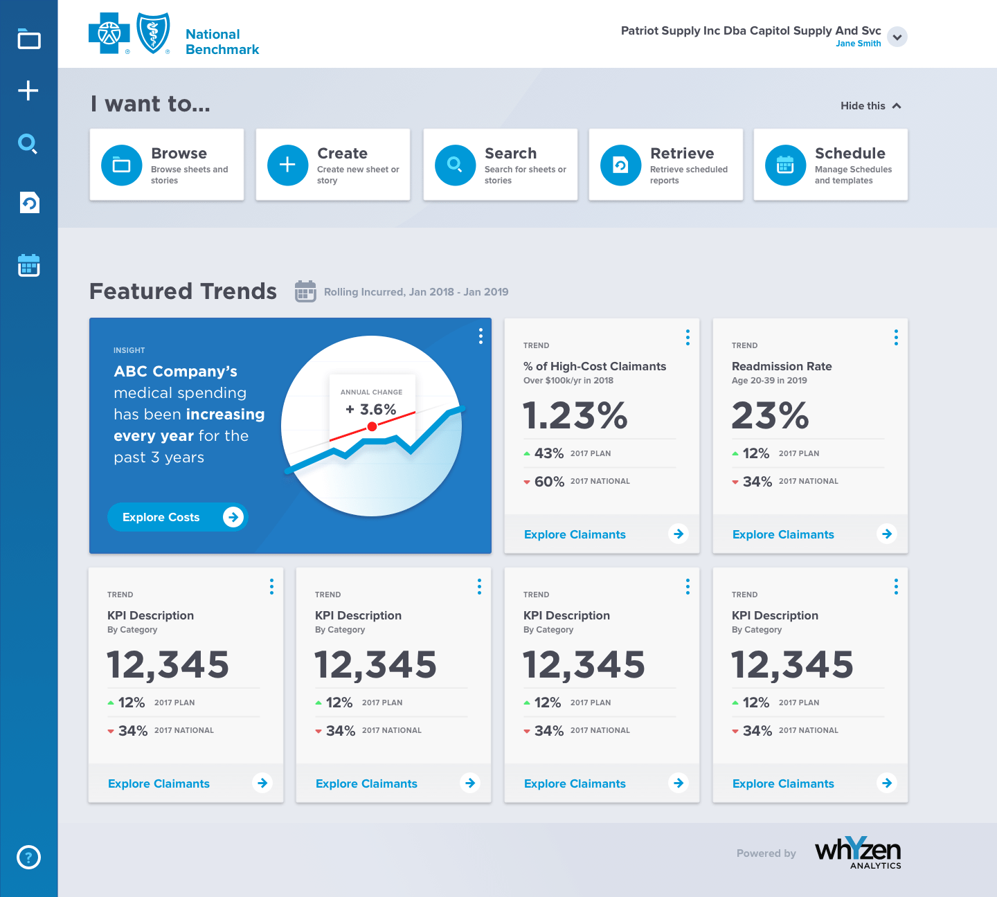
The visual language developed in the designs was then captured in a comprehensive guidelines document that set parameters for generating new screens, components, and interactions beyond the finished project.