enterprise
integration

B2B multi-site strategy and design

ARM Website Redesign
Research, Strategy, Information Architecture, Visual Design

Integrating Multiple Product Lines into a Unified UX

gotomedia partnered with Arm to rearchitect and rebrand its website, integrating a new product line that differed from its core business. This called for a significant restructuring of products and services to meet the needs of new customers, ensuring intuitive navigation, clear product and service information, and implementing Arm’s new branding.

"The Arm website redesign addressed a key business mandate to provide a user experience that simply and intuitively addressed the needs of an expanding but diverse user base, while at the same time creating a visual narrative that conveyed a unified product and marketing message."

– Sean Dolan, Senior UX Strategist, gotomedia

Building Baseline Understanding informative research

gotomedia started the project by conducting background research to help both internal stakeholders and the design team frame the problems to be addressed. Given that Arm was moving into a new area of business, the focus of the research was geared towards gaining a primary understanding of business priorities and user needs.

18 Stakeholders & Customers Interviewed
15 Mobile Evaluation Focus Areas
6 Competitors Reviewed

Defining the Approach design strategy & stakeholder workshop

At the outset of the design phase, gotomedia consolidated the research-driven insights to identify key elements of the design that needed to be addressed and prioritized. Stakeholders from Marketing, Creative and Technology were led through a day-long work session to confirm elements to include in the design, as well as to create rapid designs to brainstorm different approaches.

phase deliverables

  • Organizational Models
  • Product Messaging and Organization
  • Structure and Layout Guidelines
  • Content and Design Planning

Laying the Groundwork information architecture

site models & site maps

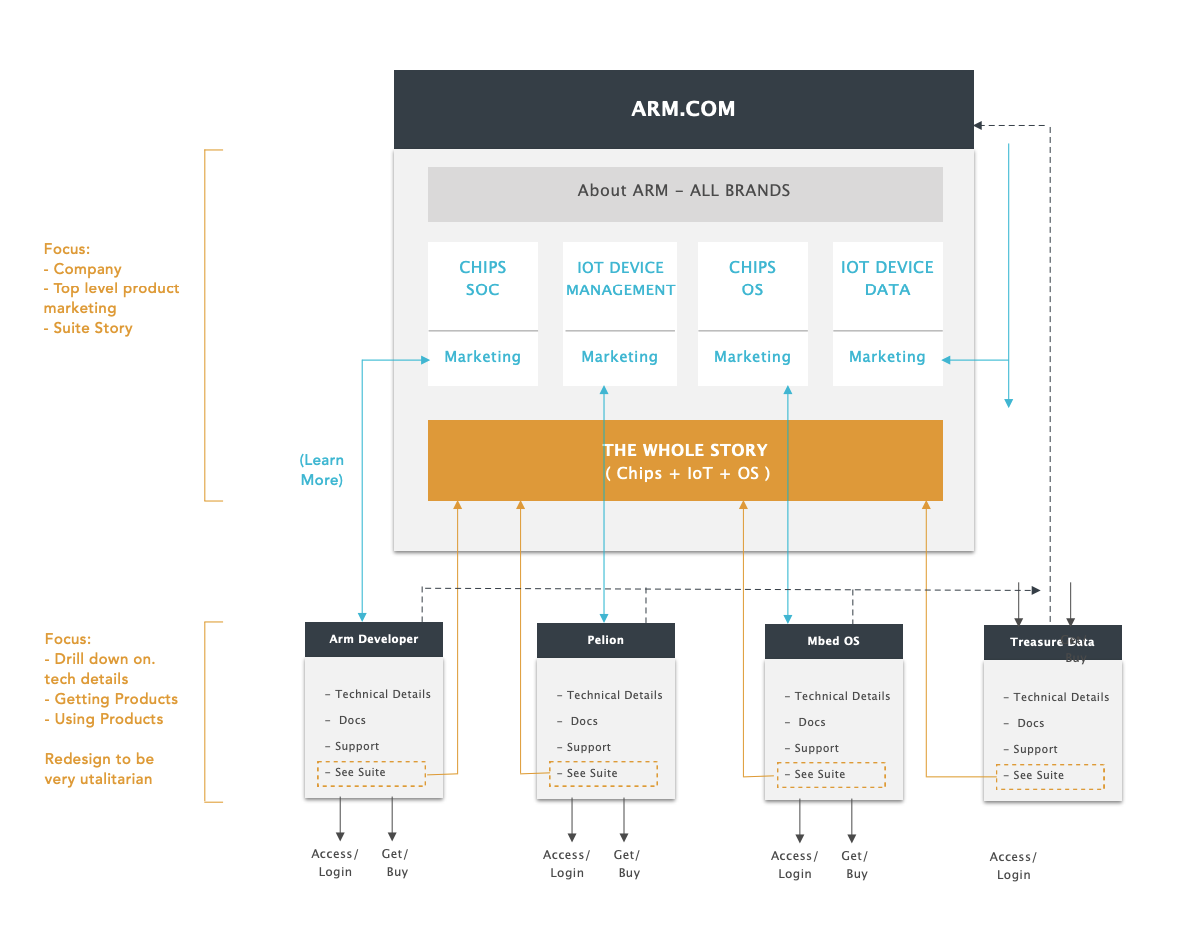
gotomedia defined site models and sitemaps to rationalize the relationship between Arm.com and the different Arm supporting sites (sub-brand sites & developer sites). A key component of the iterated model was defining an overall navigation structure & product taxonomy.

A site model for the reseigned Arm.com website that shows it's relationship with secondary sites. Arm.com is shown at the top with the various content it covers. To the left of Arm.com is a callout describing the focus of the site as "Company, Top level product marketing, and suite story." Below Arm.com  are shown the sites "Arm Developer", "Pelion", "Mbed OS", and "Treasure Data." The Focus listed for those sites is "Drill down on tech details, Getting Products, and Using Products"

wireframes

gotomedia's high fidelity wireframes helped close the gap between user assumptions and product capabilities by helping stakeholders visualize the site execution during early exploration and ideation.

Establishing Look & Feel visual design

evolving the digital brand

gotomedia worked closely with the brand team to evolve existing brand guidelines in a digital context and create dynamic styling in the spirit of the recently overhauled brand. The evolved styling was applied to Arm.com and across other Arm digital properties.

homepage design exploration

gotomedia's design exploration began with creating multiple homepage design directions to define the application of the guidelines in a web context.

all of the details

Details for every aspect of the site and interaction design were developed as part of the visual design process.

Header Design
Pattern Usage
Iconography
Multi-level Menus
Photography
Brand Graphics

Have a project for us?

Let's chat